A graph in blop is simply a set of data. In order to draw it, one
has to interpret the data of the graph somehow: which column is the x
coordinate, y coordinate, etc. This is done by the graph drawer
objects, which (by overwriting the virtual
) specify how a
graph should be drawn. To be able to plot a graph, one has to
associate a graph drawer with it, that is, to set the
Graph drawers can interpret the data stored in graph as they wish
(they decide which column is to be interpreted as x-coordinates,
y-coordinates, errors, labels, etc). Accordingly, they require the
graph to have different number of columns. In the following
descriptions the number in parenthesis shows this number. The
following graph_drawers exist currently:
- lines (2)
-
The 1st and 2nd columns are interpreted as x- and y-coordinates,
and the graph is drawn with lines connecting the given
points. This style uses the linecolor,
linewidth and fill properties of the
visualized graph. If the fill property of the graph is
true, the area surrounded by the lines will be filled (with
the fillcolor of the graph as well.
Empty lines in the datafile between data blocks will cause the continous
line connecting the datapoints to be broken at this place. If you want to avoid this,
use the break_line(bool) member function: plot("data.dat").ds(lines().break_line(false));
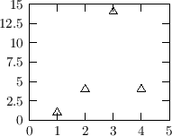
The plot on the right was created with the following command:
plot("<< 1 1\n 2 4\n 3 14\n 4 4").ds(lines());
|

|
- points (2)
-
1st and 2nd columns are interpreted as x and y coordinates, the
graph is drawn with symbols (or points). This style uses the
pointsize, pointcolor and pointtype
properties of the graph.
The plot on the right was created with the following command:
plot("<< 1 1\n 2 4\n 3 14\n 4 4").ds(points()).pt(triangle());
|
|
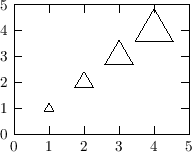
- spoints (3)
-
1st and 2nd columns are interpreted as x and y coordinates, the
graph is drawn with symbols (or points). Column 3 specifies
the size of each point as the multiple of the pointsize
property of the graph (for example a number 2 in the 3rd column
sets the size of that point to 2-times the pointsize of the graph).
This style uses the pointsize, pointtype and
pointcolor properties of the graph.
The initial 's' stands for 'scaled'.
The plot on the right was created with the following command:
plot("<< 1 1 1\n 2 2 2\n 3 3 3\n 4 4 4") .ds(spoints()).pt(triangle());
|
|
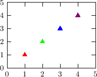
- cpoints (5)
-
1st and 2nd columns are interpreted as x and y coordinates, the
graph is drawn with symbols (or points). Columns 3-5 specify
the color of each point (red,green,blue). This style uses the
pointsize and pointtype properties of the
graph. The initial 'c' stands for 'coloured'.
The plot on the right was created with the following command:
plot("<< 1 1 1 0 0
         2 2 0 1 0
         3 3 0 0 1
         4 4 0.5 0 0.5").ds(cpoints()).pt(ftriangle());
|
|
- dots (2)
-
This is the ideal drawstyle for scatterplots. At every (x,y)
point a tiny dot is drawn. Much more effective than for example the
points drawstyle (which draws the
given point as a complicated object, resulting in large output files)
The drawback of the dots style is that its size can't
be scaled. It is the smallest dot, which the output medium can produce.
|
|
- splines (2)
-
1st and 2nd columns are interpreted as x and y coordinates, and
a spline (a continuous smooth line which goes through all
points) is drawn (width and color determined by
linewidth and linecolor of the graph).
If the fill property of the graph is set to
true, no line is drawn, but the area below this spline is
filled with fillcolor of the graph.
An empty line in the datafile will cause the spline to be broken
at that point. If the graph is filled, the area will also contain
horizontal empty gap at this point.
The plot on the right was created with the following command:
var data = "<< 0 1
               1 3
               2 4
               3 9
               4 7
               5 6";
plot(data,_1,1.3*_2).ds(splines()).fill(true).fc(color(0.8,0.5,0.5));
mplot(data).ds(splines());
mplot(data).ds(points()).pt(fsquare()).ps(MM);
|

|
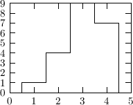
- histo (2)
-
Draws the graph as a histogram. Uses the linewidth and
linecolor properties of the graph. If the fill
property of the graph is true, it fills the histogram (the
area below the histo) with
fillcolor of the graph.
The plot on the right was created with the following command:
plot("<<
         1 1
         2 4
         3 9
         4 7 ").ds(histo());
|
|
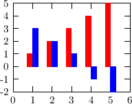
- bars (2)
-
Draws the graph with bars: the position of the bars is specified
in the first column (x), and the height (y) of the bars in the
second column. This accepts (optional) additional specifications
in parentheses, which are the width of the bars, and the offset
(see below). These values default to 4*MM and 0. E.g. you can write:
plot("datafile1").ds(bars(4*MM, -2*MM));
plot("datafile2").ds(bars(4*MM, 2*MM));
This draws 4 mm wide bars. The bars for datafile1 are offset by
-2 mm, the bars for datafile2 are offset by 2 mm, so they are just
put next to each other.
The plot on the right was created with the following command:
set::xrange(0,6);
var data = "<<
      1 1 3
      2 2 2
      3 3 1
      4 4 -1
      5 5 -2";
plot(data ,_1,_2).ds(bars(2*MM, -MM))
                 .ac(red) .legend("");
mplot(data,_1,_3).ds(bars(2*MM,  MM))
                 .ac(blue).legend("");
|
|
- labels (3)
-
Draws the labels specified in col. 3 at (x,y) positions
specified in columns 1 and 2. The alignment and angle (and
optional offsets in the horizontal and vertical direction) can
be specified in parentheses appended to labels. They
default to central alignment, 0 angle and offset. The
example below puts labels centered in both directions, rotated
by 10 degrees, and shifted by 2 and 3 mm in the horiz and vertical
directions:
   plot("datafile")
     .ds(labels(sym::center, sym::center,
                10, 2*MM, 3*MM);
The default values are: sym::center, sym::center, 0, 0, 0
Single values can also be adjusted with member functions:
   labels::xoffset(const length &xoff);
   labels::yoffset(const length &yoff);
   labels::offset(const length &xoff, const length &yoff);
   labels::angle(double ang);
   labels::xalign(sym::position xal);
   labels::yalign(sym::position yal);
   labels::align(sym::position xal, sym::position yal);
For example
plot("datafile").ds(labels().xalign(sym::right).xoffset(2*MM));
The plot on the right was created with the following command:
plot("<<
        1 1 \"one\"
        2 2 \"second label\"
        3 3 \"third label\"").ds(labels());
|

|
- yerrorbars (4)
syerrorbars (3)
xerrorbars (4)
sxerrorbars (3)
xyerrorbars (6)
sxyerrorbars (4)
-
Errorbars are drawn in either x (xerrorbars, sxerrorbars), y
(yerrorbars, syerrorbars) or both (xyerrorbars, sxyerrorbars)
directions. The initial 's' refers to 'symmetric', which means
that the errorbar is symmetric, therefore it requires only one
additional number (the error: E), and the errorbars is drawn
between value-E and value+E. Otherwise the lower and upper
values of the errorbars must be provided (2 numbers). X and y
coordinates are taken from columns 1 and 2. If errorbars on the
x value have to be drawn, the next (or next 2) columns are
interpreted as errors of x. If errorbars on the y value have to
be drawn, the next (or next 2) columns are interpreted as errors
of y.
The plot on the right was created with the following command:
plot("<<
     1 1 0.1
     2 4 0.4
     3 3 0.2
     4 4 0.3").ds(syerrorbars()).legend("");
By default, points with x y coordinates lying outside of the
frame, or the range specified by xmin(), xmax(), ... etc of the graph
are not drawn. To change this behaviour globally, call somewhere the static
member function
graphd_errorbars::clip_points(false);
All graphs plotted with the errorbars style after this point will be
effected. Or, to change the behaviour only for one graph, say for example:
plot(...).drawstyle(errorbars().clip_points(false));
By default, the errorbars are not clipped, because this could be
sometimes misleading. To change this behaviour globally, call the
static member function
graphd_errorbars::clip_errorbars(true);
Or, to change it only for one graph, say for example:
plot(...).drawstyle(errorbars().clip_errorbars(true));
|

|
- xticlabels (N+1)
yticlabels (N+1)
xyticlabels (N+2)
-
This style requires another style (drawer) to be
specified in parenthesis, for example:
plot("datafile",_1,_2,_3).ds(xticlabels(points()));
The graph is drawn with the provided style (in this example
points), but additionally tics (and tic labels) are
drawn at each point on the x- or y-axis. N above refers
to the number of columns of the graph required by the given
style (in this case points). The additional one or two
columns are interpreted as the labels to be drawn at the
axes.
The plot on the right was produced with this command:
      set::xrange(0.5,3.5);
      set::yrange(0,13);
      plot("<<1 5   \"May 01\"
              2 7   \"May 02\"
              3 10  \"May 03\" ")
         .ds(xticlabels(bars())).legend("Consumed beer");
|

|
- csboxes (5, 4 or 3)
-
The name stands for 'colored-scaled-boxes' (or whatever you
wish...). The 1st and 2nd colums are interpreted az x/y values.
The value in the 3rd column is displayed using a color. If a 4th
column is present, it is displayed by the size of the box in the
x-direction. If no 4th column is present, the 3rd column is
used. The 5th column (if present) is displayed by the size of
the box in the y-column. If absent, the same is used as for the
x-size.
This drawstyle expects a fairly regular 2D grid of
datapoints. By default, this data grid is scanned to determine
the cellsize of the data (that is, the smallest difference
between two neighbouring datapoints along the x- or
y-direction). For large datasets this might be time-consuming,
and also in other cases you may want to set it manually. You can
do it using the dx(double) and dy(double)
member functions:
plot("data.dat").ds(csboxes().dx(1).dy(0.5));
A color-bar on the right hand side will indicate the colors used
to represent the values. To control this behaviour, use the
following functions:
- color_range(double min, double max) - defines the
value-range (in the 3rd column) to be represented on the
colorscale. By default the full range is used (i.e. between the
minimum and maximum of the given data values). Outlier values
can be either skipped or displayed with under- and over-flow
colors, see below.
- operator()(double min,double max) - equivalent to
color_range(min,max).
- color_range(const color &start, const color &end) -
defines the color-scale to extend 'linearly' between these two
colors. i.e. if black and white are given, than the smalles
value will be represented by black, and the largest one by
white.
- skip_outrange_color(bool) - skip (do not display)
points which have a value (in the 3rd column) outside of the
above-specified range.
- underflow_color(const color &c) - do not skip the
outlier points, but display them instead with this color. Analog
function if overflow_color(const color &).
- underflow(const color &), overflow(const color &) -
set the color to display all those values which are outside of
the displayed range. Calling this will automatically set
skip_outrange_color(false).
- color_samples(int) - set the number of color
samples in the color-legendbar.
- color_logscale(bool) - log10 of the value is used
to determine the color.
- color_title(const var &) - Set the title of the
color-legendbar on the right side.
- operator()(color (*p)(double,double,double)) - set
the function which determines the color based on the value. Its
first argument will be the value itself, 2nd and 3rd arguments
are the value limits.
plot("<<0 0 1   1   0
        1 1 0.8 0.8 1
        2 2 0.5 0.5 2
        3 3 0.3 0.3 3").ds(csboxes(black,white));
Setting fineness of color bar: Use the color_samples(int) member
function to set the number of samples on the color bar (by default on the right
of the frame). It is by default 80:
plot("filename").ds(csboxes().color_samples(160));
|

|
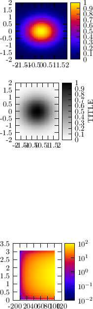
- cboxes (3)
-
The name stands for 'colorboxes'. Coloured boxes are drawn at the x
and y coordinates provided in the first two columns. The colour
represents the value (3rd column) at this point. This drawstyle
is a specialized version of the above-mentioned csboxes, so
in principle all of its member functions are useable here as well
(those which make sense at least....)
The upper plot on the right was produced with this command:
set::x1range(-2,2);
set::y1range(-2,2);
plot(_1,_2,exp(-0.5*_1*_1-_2*_2))
    .nsamples(40).ds(cboxes()).legend("");
The color legend: There is a color-bar (a 'legend') on the right
of the frame, indicating the colors used to represent numerical values.
If several graphs are plotted within the same frame with such drawstyles, that
use colors to represent values, they will all share the same color-legend.
The color-legend will adapt its range such that all the graphs using it
will fit in it. Look at colorlegend
to learn more about this.
Switch on/off colorsamples: use the legend(bool)
member function to switch off/on the sample bar:
plot("filename",_1,_2,_3).ds(cboxes().legend(false));
Title:
the title to be shown next to the legend (colorbar) on the right side can be
specified by the 'title(...)' function, as shown in the
black-white figure on the right side. Example:
plot("...").ds(cboxes().title("This is the title"));
Define minimum and maximum z-values:
The z-range (which is represented by the color) can be specified
either in the constructor, or via the parenthesis operator; examples:
plot("filename").ds(cboxes(0,10)); // constructor
plot("filename").ds(cboxes()(0,10)); // use () operator on object
Logscale for z: the z-value can also be visualized by colors on logscale. The 4th figure
on the right was created by the following script:
plot(_1,_2,_1*sin(_2))
     .p1range(1,99).p2range(0.1,3)
     .nsamples(40).ds(cboxes().logscale(true)).legend("");
set::x1tics(20);
Value to color mapping:
The default value-to-color mapping can be overridden by the user either by
specifying a start- and end-color for the value-range spanned by the 3rd column
of the graph (in which case the z-range is 'linearly'
transformed into the color-range spanned by the start/end)
or by specifying a function. To specify the colors
corresponding to the minimum and maximum values, provide them
in the constructor or in the parenthesis operator. The second
figure on the right was produced with this set of commands
(using constructor):
set::x1range(-2,2);
set::y1range(-2,2);
plot(_1,_2,exp(-0.5*_1*_1-_2*_2))
    .nsamples(40).ds(cboxes(white,black).title("TITLE")).legend("");
This example below specifies both a z-range (using the
constructor) and a color-range (using the parenthesis operator):
plot("...").ds(cboxes(0,10)(white,black));
To use a user-specified function for the value-to-color mapping,
write this function as a C/C++ function, and put it into the
parenthesis operator. (NOTE that if the value is represented on
a logscale, this custom value-to-color mapping function will
receive the log10 of the values!!) The 3rd figure on the right was produced
with this set of commands:
color quantize(double val, double min, double max)
{
    // quantize the value into 4 values
    double d =(val-min)/(max-min);
    if(d < 0.25) return yellow;
    if(d < 0.5 ) return green;
    if(d < 0.75) return blue;
    return red;
}

main()
{
    set::x1range(-2,2);
    set::y1range(-2,2);
    plot(_1,_2,exp(-0.5*_1*_1-_2*_2))
        .nsamples(40).ds(cboxes(quantize)).legend("");
}
Binning in the x and y directions:
In order to figure out the boxsize, this drawstyle has to loop over
all data point pairs, to figure out all possible differences between
x and y values. This is an O(N^2) procedure, which can be very slow
for large amounts of data. Fortunately, during the read-in of a data
graph (dgraph), or the sampling of a function-graph (fgraph), blop
automatically observes if the data sample is ordered; in this case
only neighbouring data points are compared, making the process O(N).
If you want to specify the binsize (different from the automatic
method), say this:
plot("filename").ds(cboxes().dx(0.2).dy(0.3));
When a graph is drawn with cboxes style, these coloured boxes
usually cover the axis tics, and the grids (if grids are
drawn). The cboxes style can automatically bring the
frame and/or the grids to the foreground. To switch these
options globally, use the static
cboxes::default_frame_foreground(bool) and
cboxes::default_grid_foreground(bool)
functions (for
example in the BLOP_USER_INIT()
function in your ~/.blop/bloprc.C file). All subsequent plot commands will then
be effected. To switch it only for one graph, say for example:
plot(...).ds(cboxes().grid_foreground(true));
By default, the frame is automatically brought to the
foreground, but the grid is not.
Setting fineness of color bar: Use the nsamples(int) member
function to set the number of samples on the color bar (by default on the right
of the frame). It is by default 80:
plot("filename").ds(cboxes().nsamples(160));
Under/overflow:
Use the underflow(color&)
and overflow(color&) member
functions to set the color of out-of-the-range values. If these
colors are not set, then out-of-the-range values are ignored by
default, unless the skip_outrange(false) member
function is called:
|
|
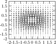
- sboxes (3)
-
The name stands for 'scaledboxes'. Scaled boxesare drawn at the x
and y coordinates provided in the first two columns. The size of the box
represents the value (3rd column) at this point.
The plot on the right was produced with this command:
set::x1range(-2,2);
set::y1range(-2,2);
plot(_1,_2,exp(-0.5*_1*_1-_2*_2))
    .nsamples(20).ds(sboxes()).legend("");
First the x and y values are scanned to determine the minimal distances
dx and dy between them. Once this is done, these dx and dy values will
be used as the 'binsize', and the maximal z-value (3rd column) will be
represented by a box of this size. The dx and dy values can be explicitely
specified by the user also, in which case they will not be determined from the
data. This is useful if the x/y values are not on an equidistant grid, or
they do not fill up the whole grid:
plot("datafile").ds(sboxes().dx(1).dy(2));
By default the minimum and maximum box sizes correspond (almost) to the
range spanned by the z-values in the 3rd column of the graph. In order
to explicitely specify these limits, provide them in the
constructor or use the parenthesis operator on an already
constructed object:
plot("filename").ds(sboxes(0,10));   // or equivalently the next line:
plot("filename").ds(sboxes()(0,10));
|
|
- mosaic (3)
You will love this! This is to plot a 2D value-map
(as for example cbox does), but in an arbitrary
parametrizatioin in the plane. That is, the cells, which
are filled with a color to represent the value in the 3rd
column, are not boxes now, but have a form adapted to the
parametric coordinate system. That is, the 2D plane is
covered by areas of different shape: mosaics, hence the name.
This is the only drawstyle,
which does not interpret the data provided in the graph
as x/y (cartesian) values, but as parameters. Since
finally everything is drawn in the cartesian coord system,
this drawstyle needs to know the parameter->xy mapping
function. For example if your data (in a file, for example)
contains 3 columns: (r,theta,value), then plot it with this
command:
plot("data").ds(mosaic(_1*cos(_2),_1*sin(_2)));
The two functions in the argument list provide the
(r,theta) --> (x,y) mapping. The mosaic drawstyle
does the following:
- scans the input data for the discrete values
of the parameters (always cols 1 and 2)
to figure out the stepsize/cellsize in the parameter
space for each datapoint
- scans the input data again, and for each
point (p1,p2,val) it takes a 'rectangular' cell
around (p1,p2) in the parameter space, and -
using the mapping function - maps this cell
into another cell in the (x,y) space. The borders
of this cell in the (x,y) space follow the
p1=const or p2=const lines.
- fills this mosaic with a color representing the value
in the 3rd column
The plot on the right
shows the quadrupole field 2*x*y, in a cartesian (2*x*y), polar
(r^2*sin(2*phi)) and hyperbolic (2*v^2) parametrization.
Code to produce this plot
    mpad &f = mpad::mknew(1,3);
    f.cd(1,1);
    set::xtics(5);
    set::ytics(2);
    set::xrange(-10,10);
    set::yrange(-10,10);
    plot(_1,_2,2*_1*_2).ds(cboxes(-200,200))
	.nsamples1(20).nsamples2(20).p1range(-10,10).p2range(-10,10).legend("");
    f.cd(1,2);
    set::xrange(-10,10);
    set::yrange(-10,10);
    plot(_1,_2,_1*_1*sin(2*_2)).ds(mosaic_polar(-200,200))
	.nsamples1(20).nsamples2(20).p1range(0,30).p2range(0,2*3.1415);

    f.cd(1,3);
    set::xrange(-10,10);
    set::yrange(-10,10);
    // hyperbolic parametrization: u=-0.5*ln(y/x), v=sqrt(x*y)
    // x = v*exp(u), y = v*exp(-u)
    // 2*x*y = 2*v^2
    plot(_1,_2,2*_2*_2).ds(mosaic(_2*exp(_1),_2*exp(-_1))(-200,200))
	.nsamples1(20).nsamples2(20).p1range(-0.5*log(1000.0),-0.5*log(0.001))
	.p2range(-10,10);
    mplot(_1,_2,-2*_2*_2).ds(mosaic(_2*exp(_1),-_2*exp(-_1))(-200,200).legend(false))
	.nsamples1(20).nsamples2(20).p1range(-0.5*log(1000.0),-0.5*log(0.001))
	.p2range(-10,10);
mosaic_polar is a special case of this drawstyle,
with mapping functions predefined to the polar parametrization
By default, mosaic assumes that the parameters are
provided on an equidistant grid. It calculates the smallest difference
between adjacent parameter values, and this will be used as the
box size around each (param1,param2) value. By this way, one can
skip parts of the parameter space. If this approach is not appropriate,
use the fixdp(false) member function:
plot("filename").ds(mosaic(...).fixdp(false)) In this case
the whole parameter space will be covered, box sizes around a
(param1,param2) point will be calculated as the midpoint to the
adjacent (param1,param2) value.
-
|

|
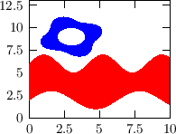
- bands(4), xbands(3), ybands(3)
-
A filled band is drawn. In the case of bands, columns 1,2,3,4
are interpreted as x1,x2,y1,y2, the band is drawn between (x1,y1) (x2,y2) points.
In the case of xbands, columns 1,2,3 are interpreted as
x,y1,y2, and
the band is drawn between y1 and y2 as the function of x. In the case of ybands
columns are interpreted as x1,x2,y, and the band is drawn between x1 and x2 as
the function of y. The
fillcolor property of the graph is used as the color.
The plot on the right was produced with this command:
set::xrange(0,10);
set::yrange(0,13);
plot(_1,2+sin(_1),6+sin(1.5*_1)).ds(ybands()).fillcolor(red);
mplot(3+cos(_1),
      3+(2+0.3*sin(4*_1))*cos(_1),
      9+sin(_1),
      9+(2+0.3*sin(4*_1))*sin(_1))
	.ds(bands()).ac(blue);
|
|
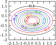
- isolines(3)
-
This style draws isocurves of a surface. One can either plot data
or functions with this style.
The style isolines needs 3 columns, interpreted as
x, y (position coordinates), and z (the value to be plotted).
The plot on the right was produced with this command:
set::x1range(-2,2);
set::y1range(-2,2);
plot(_1,_2,exp(-0.5*_1*_1-_2*_2)).ds(isolines()).legend("");
One can set various properties of the plotting style as usual. A few
examples are shown below.
// isolines are calculated on a logscale
plot(_1,_2,exp(-0.5*_1*_1-_2*_2)).ds(isolines().logscale(true).turn_labels(false));

// draw isolines at the specified values
plot("filename").ds(isolines().at(1,4,5));
Equidistant lines, specifying stepsize:
In order to draw equidistant isolines with a given distance, use
the step(double stepsize, double val=unset) function.
Here the second (optional) argument specifies a value, from which the
steps are calculated (for example step(1000,5) will use isolines at
...,-995,5,1005,2005,...)
Specifying min/max values (range):
To draw isolines only in a given range, use the
min(double) and max(double) member functions:
.ds(isolines().min(100)) (this accepts values only larger
than 100)
Switching off value-labels:
In order to not print the isovalues onto the isolines, you can
switch them off: labels(false);
The labels printed on the isolines (by default the isovalue itself)
can be specified by the labels(var lab1, var lab2, ... var lab10)
member function. For example:
plot("datafile").ds(isolines().at(1,10,100).labels("$10^0$","$10^1$","$10^2$"));
Positioning labels: By default, the labels along the lines
are positioned using an algorithm, which tries to put them rather
apart from each other, and from the edges of the frame. This can be
changed using the center_labels(bool) member function, which will
try to position the labels at the centers of the lines:
plot("datafile").ds(isolines().center_labels(true));
Specifying colors: The subsequent colors used to
display the isovalues can be
specified by the colors(col1,col2,...) member function:
plot("datafile").ds(isolines().colors(red,white,black,blue));
Note that this drawstyle can be used to plot curves defined by a
constraint. For example if F is a function of x
and y, then the curve defined by the constraint
F(x,y)=0 can be plotted as
plot(_1,_2,F(_1,_2)).ds(isolines().at(0));
This method can be used as a visual root-finding of equations.
This is how one can set the format of the labels on the isolines
(printf style). The default is "%g".
plot(_1,_2,_1*_2).ds(isolines().labelformat("Zvalue=%g"));
|
|
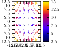
- vectors(4)
-
Draws a vector field. It requires 4 columns, the first
2 are interpreted as x/y values, the 3rd and 4th colums
are interpreted as the vector x/y components. The
.norm(8) function in the example below sets the
normalization of the vectors (a vector with length 8 would
fill one cell of the data grid).
plot(_1,_2,-_1,_2).ds(vectors().norm(8).use_color(true).arrow(arrowhead::filled())).nsamples(6)
                  .p1range(-10,10).p2range(-10,10);
To change the arrow style, one can use different arrowheads. The
default arrowhead is arrowhead::simple:
plot(...).ds(vectors().arrow(arrowhead::filled()));
Further member functions (to be called as
.norm(...) in the example above):
- .pos(f)
- Specifies the position of the vectors. The value of
f can be: sym::begin, sym::end or
sym::center, meaning that either the beginning, end or
center of the vector is placed to the (x,y) point. Default value
is sym::center.
- .min(v)
- Specify the minimum length of vectors (shorter than this
will be skipped)
- .norm(v)
- Normalize to v, that is, a vector of length
v will fill one cell of the data grid
- .clip(bool)
- Clip the plot at the frame boundary (do not allow arrows
to extend the frame)
- .arrow(const arrowhead &)
- Specify the arrowhead of the vectors
- .arrowlength(const length &)
- Specify the length of the arrowhead for the maximum
value. The arrowhead for the shorter vectors will be scaled down
if the scale_arrow(true) was specified
- .arrowangle(const length &)
- Specify the angle of the arrowheads
- .scale_arrow(bool)
- Wether the arrowhead should also be scaled as well (and not only the length)
- .use_color(bool)
- Use also color to visualize the length of the arrows. If it is not set, the linecolor of the
graph to be drawn will be used.
- .use_color(const function &)
- Specify, what function of the datapoints should be used as a color-key.
By default it is the length of the vectors, that is, sqrt(_3*_3+_4*_4). Be sure,
that if this function uses arguments larger than 4, then the graph must also
have the corresponding number of columns. Using this function automatically
switches on using the colors.
|
|
A color legend is a 'ruler' (typically on the right side) showing a
range of colors, together with a scale of numerical values, to
indicate the numericalvalue-to-color mapping. The
drawstyles use
it.
If a frame has several graphs plotted with such drawstyles (i.e. which
use a colorscale to represent numerical values), they very
intelligently share the same color legend on the right side, and the
color legend will adapt its scale such that all graphs fit in it. The
user typically does not have to care about it.
However, the user might want to share a color legend among several
graphs. The simplest way is to share colorlegends based on a name:
Another example gives more control to the user about where to put the
colorlegend, access to the colorlegend itself, etc:
(hopefully) every
graph drawer, which draws lines when drawing the graph, will use a
solid, dashed or dotted line, depending on the
property of that
graph.


